
When I first started blogging more than ten years ago, I admit that time and energy were sometimes in short supply, even for the creative pursuits for which I was most passionate.
There were times when posting a new article to my blog each week was a challenge.
When I needed to prioritize my time and energy, the blog article came first and the featured photo came second.
That being the case, I sometimes took the easy road and just reused one of the pictures that appeared in an earlier article.
I could get away with it back then. The layout I chose for my blog only featured one story at a time. To see previous stories, readers had to scroll down to see the one prior, then the one before that, and so on.
But last summer, when I changed to a more magazine-oriented format in which readers can now see up to 20 articles (as well as their featured photos) per page, the repetition of certain pictures was now in plain sight.
When I focus tested the new design, among the comments I received was the suggestion that at a glance, the repeated photos looked like repeated articles.
Fortunately, I didn’t stress about it too much. It’s not like I had to replace all of the duplicates overnight. I felt comfortable chipping away at the project a little at a time.
I turned to a royalty-free stock photo service to fill in some gaps, and it served me very well. To me, this was a temporary solution.
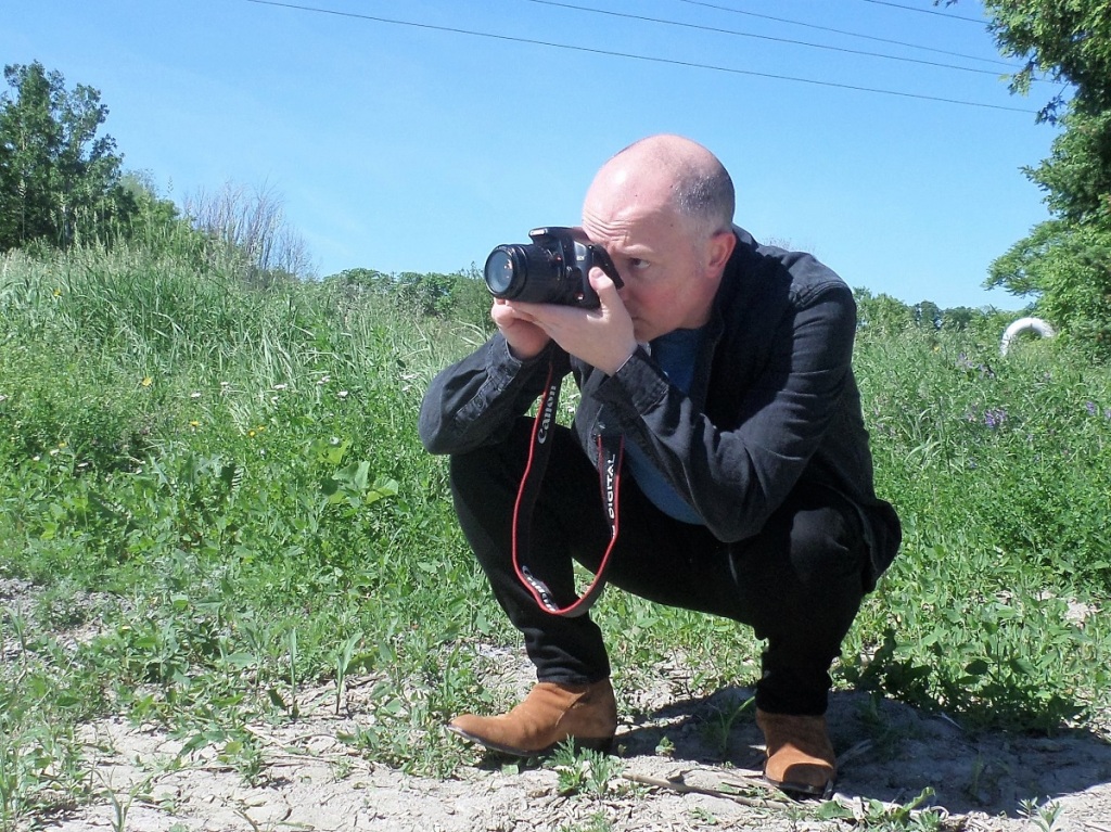
As an artist who has dabbled in photography for almost 50 years, it didn’t make sense to me to use someone else’s photos when I wholeheartedly enjoyed this aspect of the creative process. And now, in retirement, I had the time and the energy.
So I got to work.
My first priority was to provide pictures for the few blog posts that didn’t have a featured photo.
The second priority was to create new stock photos to reduce repetition.
The next priority was to hunt for new images where the featured photo wasn’t truly representative of the article or that I felt I could do better.
And fourth was editing pictures that matched the article well but needed some brightening or correction to better draw attention to the article.
I had my work cut out for me.
But over the course of a few months, with concerted effort, I managed to swap out many of the photos for fresh new ones that I am convinced have given the blog a great lift.
And what a learning curve it was to get to that point.
Here are some highlights I’d like to share with you:
Will the image translate well for all devices?
When selecting a photo, the author needs to bear in mind that the image will likely be viewed on mobile devices, tablets as well as desktop screens. A picture that shows well on a large desktop screen might not show well on a small mobile device and vice versa. After posting an article, the author should take a moment to note how the image appears in the three different formats (if possible). If it doesn’t translate well to one (or more) of the three, then the author should consider adjusting it with an editing app/software or reshooting and replacing it.
Lighting
One thing that surprised me was the strange play between light and shadow. On a few occasions, a photo that appeared well lit when viewed on my desktop, suddenly had shadows or appeared very dark when shrunken down to a thumbnail. In that situation, if it can’t be brightened up with photo editing software, the author should consider trying again under more consistent lighting conditions.
Composition
My advice for the composition of the photo is the old adage that less is more. Busy pictures with many elements tend to be hard to make out on a small mobile device. To me, a shot comprised of a clear, strong focal point in the foreground makes the strongest impression in all three formats.
Background
When it comes to backgrounds, less is more as well. For the focal point to draw in the reader, there should be as little interference in the background from busy patterns, competing colours or distracting items having a photo-bombing effect.
I’d like to think that my many years of watching The Price is Right have helped in that regard, demonstrating camera shots with excellent use of composition and camera angles to make products and prizes fill out the screen and stand out against neutral and non-distracting backgrounds.
Compatibility with other platforms
If the article will be shared in other platforms and the picture will appear as a thumbnail, I would suggest checking out how the platform converts the featured photo, to ensure compatibility. For example, an image with “portait” orientation might look great, but when converted in another platform to “landscape”, the top and bottom of the image might get chopped off and look awkward. So far, I have found that WordPress, Medium, Facebook and X (formerly known as Twitter) work best on “landscape” oriented images in 4:3 format.
The apparent universality with “landscape” orientation
Because of the previous point, when I am taking stock photos, I always shoot them in landscape. Cropping photos that were taken in portrait orientation might lead to losing some key parts of the image or for the main subject to appear too close.
Change can be good
At the end of the day, if you glance through your blog and a certain picture bothers you, change it. There is nothing that says a featured photo for an article has to remain there forever. You never know when swapping in a new featured photo might roll out the red carpet for new readers.
Alt-text
Don’t forget to add a description of your photo in the “Alt Text” section, for readers with visual impairments and low vision who rely on the computers for screen reading.
With these lessons learned – and still learning more every day I work at it – I found this part of the blogging process to be very rewarding and a natural extension of the creative process.
The more I got into it, the more my awareness heightened for spotting good photo opportunities as well as the knowledge of what editing was needed to make them featured photos that complemented the story.
Even though creating stock photos adds to the lead time in developing and publishing an article, to me it’s worth it.
There is nothing more satisfying than having a great story, supported by a great title and a great picture that I took myself, and for which I feel very proud of the overall presentation.
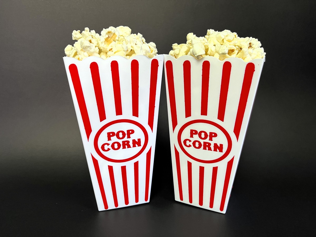
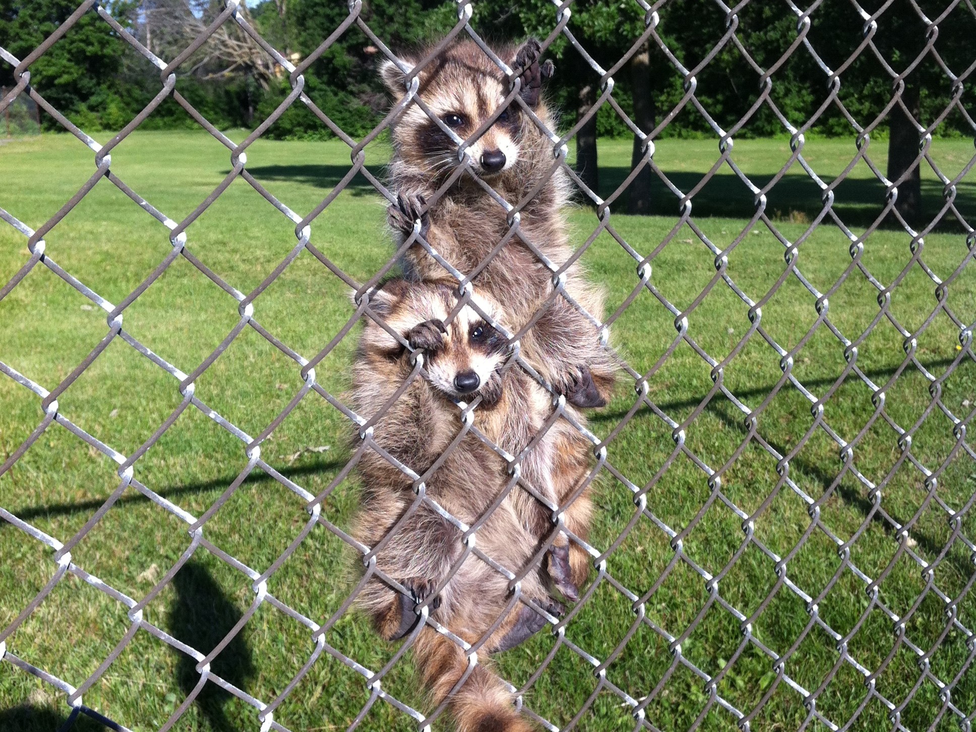
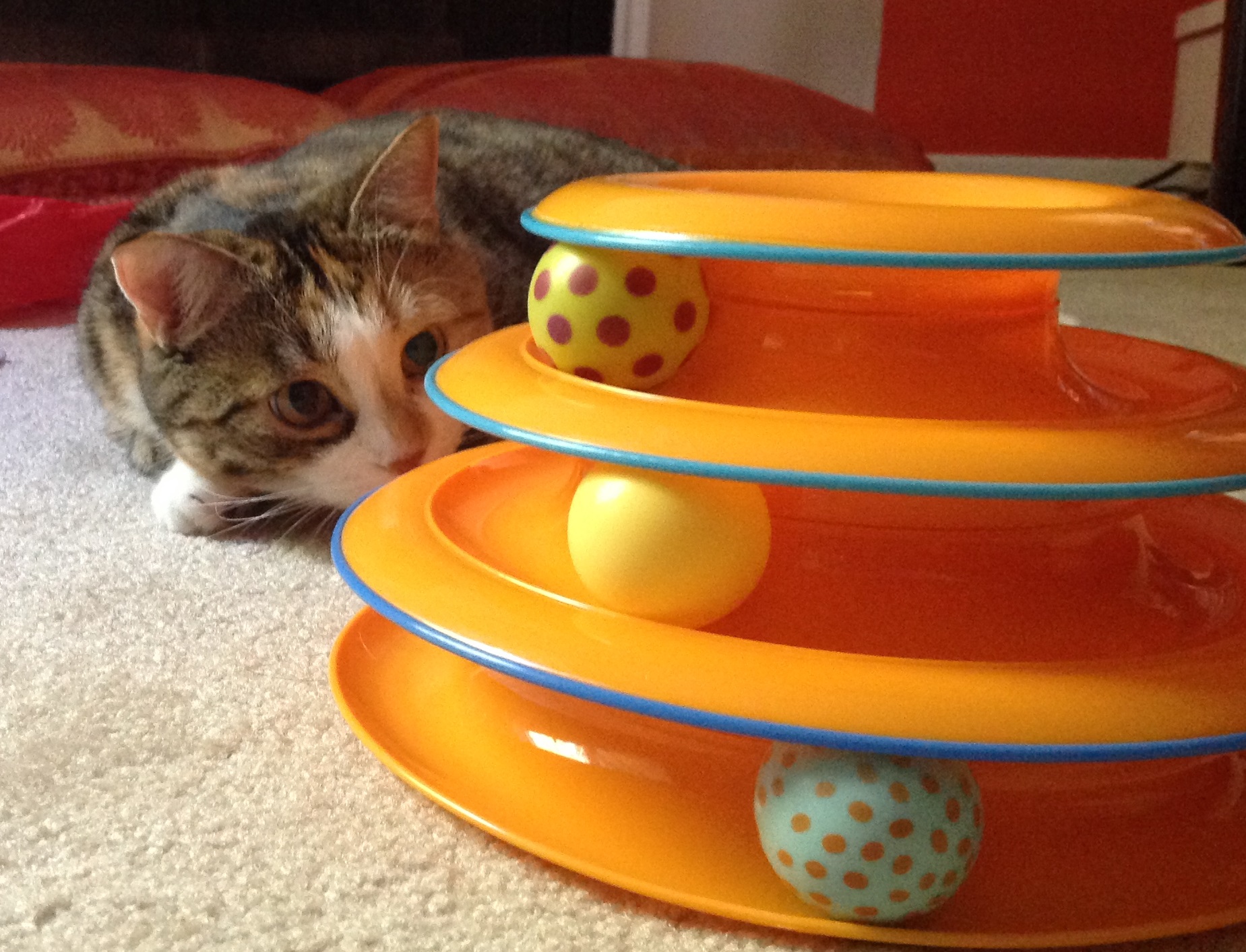
Here are a few of my favourites:
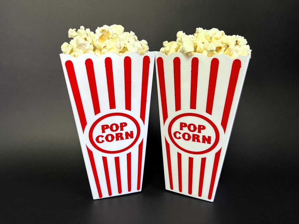
A staged shot of two containers of popcorn against a black background.
A rural landscape shot of a field of wheat under a blue sky

An irresistible photo of two baby racoons climbing a fence, while I was out on a morning run.
A great shot of my cat Ivy while engaged in play time.
An interesting shot of a typewriter with its keys jammed up, that was on display in a shop.

Did you enjoy this post? If you did, your likes and shares are most appreciated.
If you haven’t already, please check out the rest of my blog at andrebegin.blog. From there, you can click on the “Follow” button to receive future posts directly in your inbox.
Sincere thanks for reading!
Have a great day,
André


Leave a comment