
I’ve never thought of myself as being shy around technology.
I took BASIC computer programming in high school (that should give you a hint as to my age). After my first summer working full-time, I bought my own little computer (a VIC-20). And when I first joined the workforce as a data entry clerk, a computer terminal on my desk was a necessary work tool.
Over the years, I picked up the principles of new software fairly easily and was often asked to help my colleagues with computer tips and tricks.
And even now, in retirement, in following my passion for creative writing, I’ve had to learn how to maintain my own computer, now that I lost regular contact with my office’s IT department to whom I could ask the occasional maintenance question in passing.
That being the case, I never thought I would ever see myself as that person who struggled with technology.
Even less so, did I envision that challenge at the checkout counter at grocery and department stores.
I’ve never had a problem with self-checkouts. In fact, I enjoy being able to pack my groceries the way I think they should be packed, Tetris style, not in the order in which the items came down the conveyor belt.
But it’s when I’m staring at my final total that I start to look like an idiot.
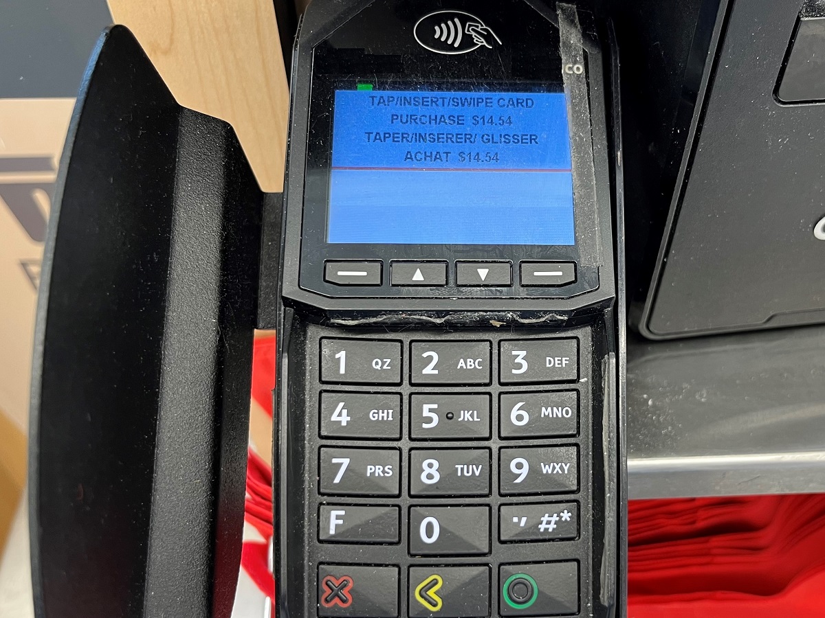
As I pull out my trusty credit card to pay for my purchases, I start doing that weird dance of leaning to the left, leaning to the right, getting up on my tippy toes, looking up, looking down to find where I am supposed to tap my credit card.
Why does it have to be different from one place to another?
Why the differences in styles with point of sale devices?
It’s not that I feel an overwhelming pressure to hurry when I am at the self-checkout in the early morning hours, in the presence of my own peer group. But I do feel all eyes turn on me when people wonder, “What the heck is he doing?” as I perform my interpretive dance routine in search of the tapper.
I often fear the dire repercussions of a computer saying, “session has timed out” when I’ve taken too long.
Sometimes the tap at the top of the little machine. Sometimes it’s on the side.
At one department store it’s not on the machine at all. It’s actually on the keyboard of the cash register terminal.
I feel completely vindicated when a store actually tapes a hand written note to the device indicating where the tap is located. Obviously there is an issue, and it’s not just me!
At the pet store, I often find myself asking, “Where do I tap?” even though I may have done this many times before at this location and now looking like I’m suffering from short term memory loss.
It is in those moments that I think to myself that I need to remember this moment the next time I might be behind someone who is struggling at a check-out for any reason.
When it comes to usability and interoperability for point of sale technology, do companies consult with seniors? (I honestly don’t know… I’m just asking.)
Just in my own circle, I have heard how the numbers on the readouts are either too small or they are hard to see when someone is afflicted with cataracts.
I can appreciate how we want devices to be small, compact and light, but if their design involves tiny, thin fonts, over a bright, high contrast background, is this good for all users?
Also, the beeps at the checkout can be challenging to navigate when you believe you scanned your own item, but it’s the next register over that beeped loudly. Maybe each register should beep on a different tone.
When it’s time to pay, can the tap symbol be backlit and made to blink as if to say, “Over here! Over here!”?
With thresholds being raised for the need to enter our PIN codes, I find myself using my PIN less. A good thing and a bad thing… on those rare occasions when I need to enter it, I have experienced moments of freezing up and wondering, “Oh crap… what is it?” Fortunately, the number comes back to me… eventually.
For all of these variables, I can appreciate how it may be difficult to design point of sale devices that will please everyone.
For that reason, I offer my full appreciation and gratitude to the companies designing these devices, for trying to make it easier, but that one-size fits all solutions must be a challenge.
Given the population living longer, with the power of technology why can’t a single point of sale device offer a menu of setups to suit different client needs, like a large print version, a bold print version, a low brightness version or high, medium and low volume versions?
Would this not offer a more tailored customer experience to help keep the flow of customers moving?
And most of all, can we just not put the tapper in one place and make it a universal standard?
Did you enjoy this post? If you did, your likes and shares are most appreciated.
If you haven’t already, please check out the rest of my blog at andrebegin.blog. From there, you can click on the “Follow” button to receive future posts directly in your inbox.
Sincere thanks for reading!
Have a great day,
André


Leave a comment